Packaging with Pigeon
The two founders of Pigeon approached me with enthusiasm. They had a farm producing high-quality cannabis, and a great idea to bring it to market. With regulatory challenges beginning to diminish, the macro environment was opening up, creating a clear path for their idea to flourish. However, all they had at the time was a sounding board and a vision, so they assembled a team to succeed, bringing me on board to help shape their vision into a tangible product.


Pigeon is an organic cannabis company that offers customized & curated boxes delivered directly from its farm to customers door. “The whole idea is experience-based shopping. We came up with the idea to put things in a box, making it more gift-able and therefore we’re selling a packaged experience.”
Users often struggle with understanding the effects of different cannabis strains, leading to purchases that don’t match their expectations. This lack of knowledge leaves many feeling like they don’t have full control over their cannabis experience.
A customizable & educational digital experience
Stakeholder Interview
Sourcing their own cannabis, highly knowledgable about mindful consumption, and offering a novel product.
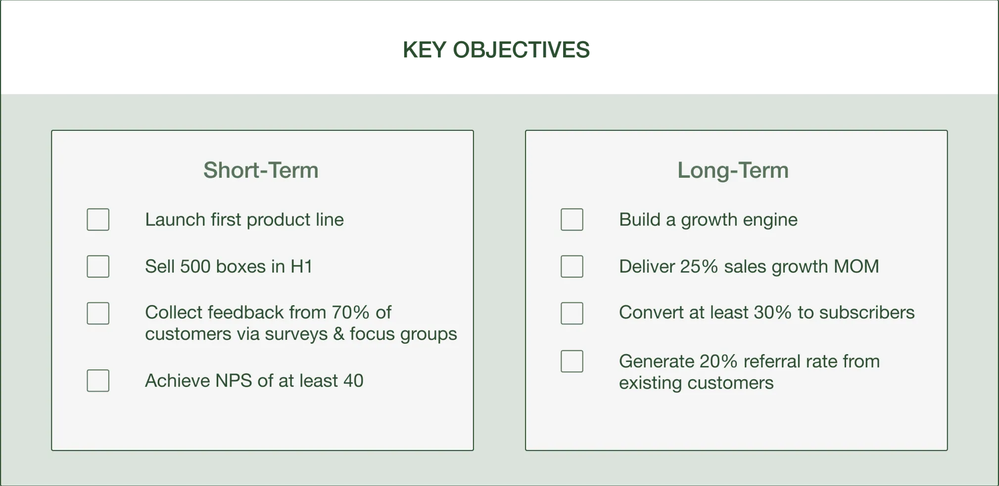
I kicked off the project by conducting a stakeholder interview to understand Pigeon's key objectives, value proposition, and the definition of success for the project. I learned quite a few things:

(Click to enlarge image)
Competitive Analysis
The majority of cannabis retailers are third party services that don’t directly source from their farm, and lack a personal story users could connect to.
After talking to the founders, I started to ask myself: How could Pigeon stand out and establish a unique identity in the market, and what services are expected from an e-commerce cannabis retailer? In order to answer these questions, we conducted a competitive analysis with 5 of the leading cannabis companies in the space.

User Survey
An overwhelming amount of respondents consume cannabis to relax & unwind.
Once we had a better picture of what’s required from a cannabis retailer, I created and sent out a survey to 20 cannabis users who were unfamiliar with the Pigeon brand. This survey had a dual purpose: it gave the team quantitative feedback on the habits of cannabis consumers, and it helped us to understand how to position ourselves in the industry.
Not only did we learn that most respondents are drawn to cannabis for medicinal purposes, but we also learned that 63% of respondents purchased cannabis through dispensaries, delivery services, or their local delis. The key takeaway for me was that the majority of respondents purchase cannabis through direct human interaction.

User Interview
Users consume cannabis for 3 reasons: Creativity, Recreation, and Pain Relief.
Once we reviewed the the survey results, we decided that it would be best to get qualitative insights to either confirm or dispel the initial data that we received. So I led and conducted user interviews with 5 participants ranging from ages 28 to 39 from different socio-economic backgrounds to see what their habits and relationship to cannabis was.
Users sourced their cannabis from reliable sources such as delivery services and delis.
None of the users purchased cannabis online due to concerns about safety and shipping times.
4 out of the 5 interviewees expressed not having control over their cannabis consumption experience.
Users lacked knowledge about strains, leading to purchases that did not align with their desired experiences.
Users felt a need for social justice reforms and desired ways to help those impacted by their cannabis.
So How Might We:
Create an educational experience that addresses users' knowledge gaps in an accessible way?
Provide a customized & controlled experience to deliver the users’ ideal cannabis outcome?
Build a reliable & trustworthy brand that establishes connection with our users?
Design Inspiration
Exploring customized experiences for onboarding, education, and item selection.
Sketches (lo-fi)


User Flow
One key feature was the ability for users to create their own custom box. As the sketches developed, it became clear that the user journey could become complex. To iron out the areas of friction I created a detailed user flow to refine and solidify the user journey.
%201.webp)
Wireframes
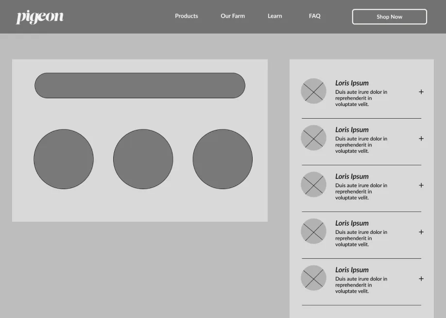
Prioritizing user preferences through personalized suggestions, and mimicking the physical shopping experience.
As we worked on the wireframes, one thing was clear: we wanted users to feel confident, curious, and excited throughout their journey. Whether they were sharing their cannabis preferences or crafting their dream box, the experience had to be smooth, engaging, and just plain fun. To bring this vision to life, we focused on two key features: the onboarding experience and the “Create Your Box” flow.

Onboarding Process
The onboarding process was all about getting to know our Pigeon customers better. While we already had some great insights from the research phase, this was our chance to dive deeper—what strains they loved, what they wanted us to grow, and what deserved a spotlight on the landing page.
As a bonus, users got to share their preferences and, in return, receive personalized cannabis recommendations at the end. It was like a little game of “tell us what you like, and we’ll match you with your perfect pick.

Create Your Box
The ‘Create Your Box’ flow was no walk in the park. Sure, the User Flow was a lifesaver, but it still took countless design tweaks to make the experience as simple and intuitive as possible. Front and center was this thought: What if the user were actually in a store, picking up a jar of cannabis and trying to fit it into a box? How could we make it feel just as natural online?


Usability Testing
WCAG incompatibility, skipping onboarding, and a desire for more robust filter settings.
Following the development of the wireframes and prototype, we conducted a usability test with 8 individuals from our target audience to confirm the clarity of our design choices and to identify any potential issues. The process revealed three major pain points:

WCAG Incompatibility
Of the eight users we recruited, seven successfully completed the scenarios we provided, while one user, who was color blind, struggled. The main issue was the low contrast of the brand colors, which made it difficult to distinguish interactive elements from non-interactive ones on the website. This led to hesitation and frustration during each task.

The Solution
I presented these findings to the team, and we decided to switch to colors that were still on brand but would also comply with WCAG standards to improve accessibility.

User Onboarding
Apparently, users didn’t really prioritize the onboarding experience. Six out of eight users bypassed the process by immediately clicking the link to the homepage. Reflecting on Steve Krug’s principle of “Don’t Make Me Think!”, the Pigeon team decided to eliminate the onboarding process, as it wasn’t the most effective method for driving conversions.

The Solution
The user would now be taken to the landing page. Here, they would be able to still have the customizable experiences that Pigeon prioritized, however, the suggestions for what cannabis would be best suited for them was eliminated (temporarily at least).
Filter Settings
Another significant issue identified was the need for additional filter options relating to potency levels. 50 percent of participants expressed a need for this feature on the product page. Given that each Pigeon box includes multiple strains with varying potency levels, finding an efficient way to implement this feature was challenging.
After chatting with the team, we realized that the number of products sold didn’t quite justify building a filter with potency options. To counteract this, I added a section on the item page where users can explore each strain in the box more in-depth. Plus, the 'Create Your Box' section includes a detailed look at the strains too.
Style Guide
Modern, natural, and organic!
Pigeon’s style guide was based on multiple conversations that I had with the founders. We wanted to highlight Pigeon’s dedication to sustainable growing practices through color and especially through our typography choices. Fresh Direct was a huge inspiration!
* For headlines and impact statements
*For body copy but can also be used for less stylized headlines
PRODUCT TRANSPARENCY
INTERACTIVE EDUCATION
A CONTROLLED USER EXPERIENCE
Next Steps
First boxes distributed, but a delayed certification process with a need for product photos.
Due to complying with federal and state regulations, the website won’t be live until certain processes are approved. Once approved, we’re looking to tackle the short and long term goals the founders expressed, in addition to modifying certain functionalities of the website.
One area of friction is a way to have discreet and secure shipping. Although using third parties such as UPS and FedEx are the most reliable, we want to bring that “Amazon” experience to Pigeon.

(Click to enlarge image)
Takeaways
I’ll admit, there are moments during the project where the founders have had a strong vision for the platform that occasionally conflicts with the user experience principles highlighted by the research. For instance, they wanted to focus heavily on developing a “passbook” feature—a digital journal where users could rate and write about the strains they had tried based on their prior experiences. While I didn’t mind exploring this feature, my primary focus was on creating an interface grounded in research rather than ideas introduced spontaneously. I am not opposed to the concept, but I want to establish a strong foundation first, and there’s no evidence that this feature is essential for users or necessary to launch the site. This led to several open discussions about which design elements should take priority.
At the same time, I’ve had to maintain constant communication with the developer to understand technical constraints within our timeline. This requires balancing the founder's vision with what was feasible and necessary. After several collaborative discussions and negotiations, we’re able to prioritize the most critical features and strike a balance that meet the project goals while maintaining Pigeon’s overall vision.


